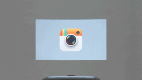
Like most of us, you may have woken up today, habitually checked your phone in the morning, only to find this colourful new icon appearing among your apps. You make a double take, only to realize that its Instagram. That familiar Instamatic camera inspired logo is no more!
In this world of material design, as Google likes to call it, app icons are moving in the direction of being two dimensional, simpler designs for that flatter look. Instagram is finally on that bandwagon.
A Little History

Instagram in its earlier days, as the old app icon suggests, was a throwback to the Kodak Instamatic camera. These cameras were inexpensive, widely available, and easy to use. Thus it was an entry point to anyone who with an interest in photography.
The Instamatic was cheap, easy to get and simple to use. All the same qualities Instagram took in—the app is free, easy to use, and is available for almost any smartphone with a camera. And because of that, Instagram became an instant hit with smartphone users and shortly emerged as the undisputable king of photography apps.
Instagram – For The Community? Not.
According to Instagram’s head of design Ian Spalter, they wanted “to create a look that would represent the community’s full range of expression — past, present, and future.”
“Brands, logos and products develop deep connections and associations with people, so you don’t just want to change them for the sake of novelty. But the Instagram icon and design was beginning to feel, well… not reflective of the community, and we thought we could make it better.”

Instead of the four main colours found in the old icon, they feel that a rainbow was more representative of the Instagram community. Colours have always been a prominent feature, be it in filters, photos and videos, and Ian explained that when re-imagining the rainbow, they needed more warmth and energy, to accompany the glyph.
While the new focus on community is good, but I can’t help but feel that Instagram is stripping away all the familiarity it has with its loyal users – everything that I am familiar with Instagram was taken away from me this morning. That image of the Instamatic camera icon has lived on our phones for so long that this sudden change comes about as a bit jarring.
While we also get that Instagram may want the logo to be more modern, the new logo is a bit too similar to all the other apps out there, and it is just confusing now because it doesn’t even look like the iconic old logo. The app icon even looks like an awkward kid trying to fit into my smartphone homescreen now.
Speaking of community, we can’t help but ask too, did Instagram seek any public feedbacks from its users on the new redesign? Were the new redesign necessary? Why change something that wasn’t broken in the first place?
On top of the icon change, when you launch the Instagram app, you will also be taken aback by the interface change. Here’s a look at the newly redesigned app interface:

According to Instagram, “while the icon is a colorful doorway into the Instagram app, once inside the app, we believe the color should come directly from the community’s photos and videos.”
Everything is still as it was before in terms of functionality, just that it is now devoid of colour, except for when you get notifications. While some may applaud the new sanitized app interface which put more focus on the images, this is probably one of the biggest visual changes the 6 year old app has introduced – one that I felt is being shoved straight to our face. As a loyal user of Instagram over the past few years, I felt a sense of betrayal. I’m quite sure that most of the other 400 million active users feel the same way too.
The Internet Gives Their Verdict
If you don’t trust me, here are what some users say:
https://twitter.com/MichaelWoods/status/730451377827143680
The first thing I noticed about it!? #instagramupdate pic.twitter.com/F1hwKVLDjP
— Josh Middleton (@MiddletonPlays) May 11, 2016
The #instagramupdate logo is absolutely annoying, I couldn't find Instagram as I didn't recognise the logo
— quisha (@quisharose) May 11, 2016
Instagrams new update got me like … ??? #instagramupdate pic.twitter.com/BIlpfSPaMh
— silipahhh (@s_bevoux) May 11, 2016
Ok seriously the new Instagram icon was such a terrible idea. #instagramupdate
— JEREMY JENSEN ?? (@jer_jensen) May 11, 2016
Instagram's latest update removes filters from public opinion. #instagramupdate pic.twitter.com/kUyqvBIzIn
— Critical Mass (@criticalmass) May 11, 2016
Am i the only one feeling naked on instagram? It's just too white and this makes me feel naked. #instagramupdate
— luigi grosu (@LuigiGrosu) May 11, 2016
The Facebook community has something to say about this too:

That’s 29 angry users for you Instagram.
Featured Image Credit: The Verge