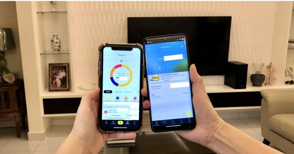
Since the launch of the MAE app, there have been mixed reactions from users on AppStore and Google Play on how the app compares to its predecessor, the M2U app.
I’ve been using M2U for 5 years now, and until today, it’s still one of my go-to financial apps to regularly make payments and check on my balance.
But knowing that I’ll eventually have to say goodbye to M2U like so many of us who are attached to it, I wanted to find out why MAE would be worth moving to now.
A Friendlier UI Right Off The Bat
How MAE differs from M2U is by having more quality-of-life features like an expense tracker, a Tabung for you to save up for a specific goal, a Makan Mana Wheel, boosters to transfer spare change into savings, and more.
Some additional things they have on the app are food deals and promotions and several articles on their app and managing your finances. You can read more about these features here.
When I first downloaded the app, I thought the UI was definitely friendlier than M2U’s. There were more directions as to what functions do what in the app. Unlike M2U, I could immediately navigate around the app easily.

I could also see all my app activity in one place without having to switch to different sections in the app to get to them.
For instance, on the M2U app, I previously could only see my savings account balance on one page, and I’d have to click on that section to see what my spendings were.
On the MAE app, however, I could immediately see what my top expenses were for the month, my total expenses for the month, and my savings account balance all in one page. So, that was a plus for MAE compared to M2U on first impressions.
An Enhanced Money Transfer Experience
Since M2U was mostly just for making payments, I made my first transfer yesterday to see if there were any big differences between the two apps.
Though the UI looks friendlier on MAE, there wasn’t too big of a difference transferring through MAE versus through M2U.
The only small difference that I noticed was that I can immediately click on my 3rd Party Favourites to transfer to without having to go through an extra step of clicking on which category to transfer to.
I could also immediately see which banks my 3rd Party Favourites use because they added bank icons next to their names. In M2U, it was only listed below their names and account numbers.

This is a convenient feature if you have friends with different bank accounts who need you to transfer to certain accounts at times.
Another small difference I liked was that I didn’t have to key in my password every time I wanted to make a transfer, which was one thing I found quite inconvenient when I was using M2U because it takes longer to load.
Then again, some people do prefer that extra step of security. Perhaps MAE could then make this extra step a preference thing via settings to please both crowds.
Improvements Can Still Be Made
One of the features I’m looking forward to using the most is the bill splitting feature (when it’s safer to gather, of course) that wasn’t present in the M2U app.
Since most of my friends use Maybank as well and we regularly split bills to transfer to one another, this will be a very convenient feature for us.
It lets us set up a group to split the bill, and we no longer have to calculate on our own or use other bill-splitting apps like Splitwise.
As for the expense tracker, while I understand how the expense pie chart can be helpful to help you keep track of your spending categories, it isn’t entirely accurate.
Ordering delivery via GrabFood is categorised under Transportation instead of Food & Beverage, which can be misleading if I were to look back at it.
Additionally, when I buy things online from Shopee, the expenses would be included under Finances instead of Shopping.
What this means is I’ll have to manually rearrange them myself on paper or another app to properly track my spending for now, which is just unwanted extra work for users.
Then again, I do understand that this app is still fairly new, so they can only track straightforward Shopping spendings if I were to pay with my card in a physical retail store. So to meticulously categorise these expenses would take time and updating on their end.
Including money coming in in the pie chart would also be more helpful than just expenses alone, because I think it’s important to see the fraction of your expenses versus your savings for a better overview of your personal finance.

Quality-Of-Life Features That Can Be Useful
As for their Tabung feature, it’s hard for me to gauge how helpful it has been for me so far because I haven’t cashed out from it yet to buy something.
I do like how detailed it is in guiding you to save up for something you want though, like setting a date and choosing if you want to contribute per week or per month to it.
One good thing about this feature is that you can also add boosters like spare change into the Tabung, which is a helpful option to hasten your goal achievement.
Additionally, if you want to set up a Tabung for travelling plans, you can add other MAE users into the Tabung with you and save up together. This makes it easier to clearly see if that friend trip will take place or not, and to keep travel plans and expenses transparent.
For someone like me with limited F&B options near my home, the Makan Mana Wheel wasn’t too helpful. However, I can see it being more useful once we’re able to return to our office in Taipan where we’re spoilt for food choice.
It’d be a fun way to settle on lunch with my colleagues too, especially since the bunch of us can be quite indecisive with where to go.
The Verdict: Will I Make The Switch?
Yes. In spite of the expense tracking feature which still isn’t at its best, I did enjoy using the MAE app much more than I did the M2U app.
I mostly enjoyed the convenience and UI of the MAE app, and by the end of the year, I probably will be able to decide if the Tabung feature has changed my savings management in any way at all.
From what other Malaysians using the app have said, it does seem like MAE is a major step-up in terms of what a banking app can achieve beyond basic transactions.
Some users have even said that it feels like it’s a proper first step to a digital banking experience, and I can’t help but agree after my own experience.
- You can learn more about the MAE app here.
- You can read about the MAE app launch we wrote about here.
Also Read: 4 Key Steps To Prepare M’sian Businesses For 2021, Based On A HSBC Survey


