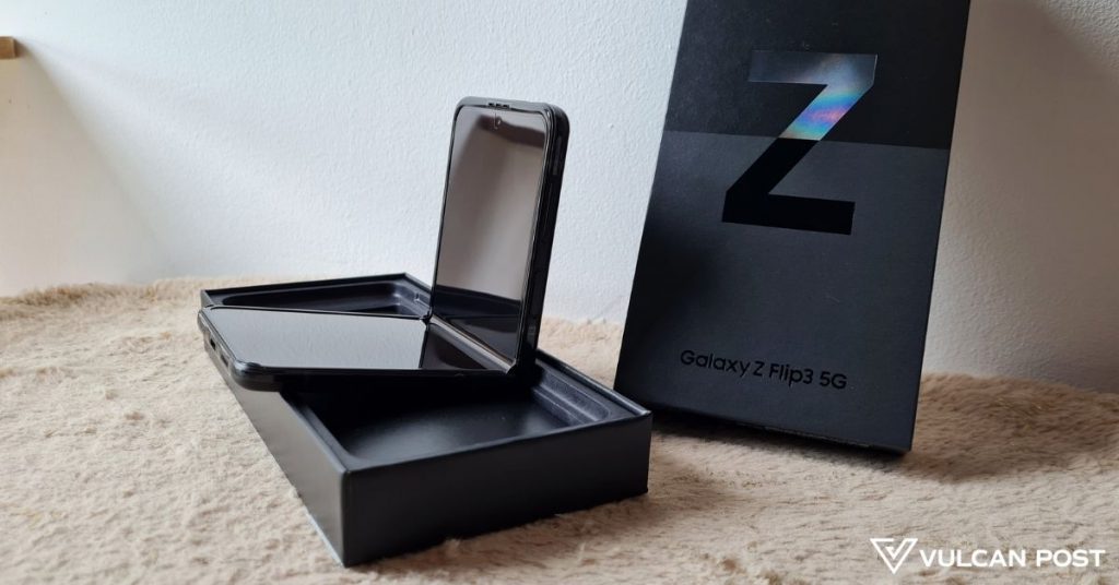
It’s finally here in my hands—Samsung’s second release of its flip phone, over one year after the Z Flip was first released. (Check out our review on Samsung’s first clamshell phone design here.)
I’m talking about the Samsung Galaxy Z Flip3, which boasts a fresh look and features. As for why Samsung skipped straight to Z Flip3 without ever releasing a Z Flip2, perhaps it’s simply to match the Z Fold3’s release and make both units easier to remember for consumers.
At first glance, the unfolded Z Flip3 doesn’t look too different from its predecessor, at least from the front. But pick it up, and you’ll immediately notice that the back of the phone is almost 80% matte, save for the cover display.

The matte metallic finish gives it a really smooth, premium feel, and while it’s not a hefty phone at 183g, it still feels solid and sturdy.
Unfortunately, we didn’t get any of the more vibrant colours and instead got the Phantom Black variant. However, the deep colour did add to the phone’s luxurious look.
On the back is also where you’d find the cover display, which has had its design revamped. For one, it’s a lot larger than it was on the Z Flip.
It went from 1.1 inches with 112×300 px to 1.9 inches with 260×512 px. This means that you can see a lot more on the cover display, which is handy when you just want to glance at notifications, the time or weather, switch your music, and more, without flipping open your phone.

You’ll also notice that the dual cameras have been rearranged vertically to give the phone a more streamlined look. They’ve also had their little bump removed, and now are integrated seamlessly next to the cover display.
Keeping what worked with minor upgrades
It has been quite a while since I had last touched the Z Flip, so I felt as though the Z Flip3 was a lot taller than its predecessor, but upon checking its specs, it’s exactly the same height.
The display is still 6.7 inches, but its screen-to-body ratio has increased by about 2.5% and is now just shy of 85%. Compared to other Samsung phones like the S21 Ultra, which has an 89.8% screen-to-body ratio, it’s clear that the Z Flip3 has thicker bezels. This could be due to necessity though, in order to reinforce the Z Flip3’s flexible screen.

Its height may have remained unchanged, but its display did get an upgrade to a Foldable Dynamic AMOLED 2X one with a 120Hz refresh rate. It also boasts a screen brightness of 1,200 nits which greatly amps up the clarity of whatever’s on your screen.
I remember being impressed by the dual cameras on the Z Flip, and seeing as the Z Flip3 has the exact same ones, there’s nothing to complain about here. Pictures taken came out really detailed and were vibrant (sometimes too saturated, but that can be tweaked post-capture).
I wasn’t impressed by the selfie camera on the predecessor, however, and my opinion remains unchanged as the same selfie camera is on the Z Flip3.
A clamshell shape that hasn’t gotten old
Onto the most interesting part of the phone: its foldability. I don’t recall exactly how the Z Flip felt in my hands when folding and unfolding it, but the Z Flip3’s hinges make the experience very smooth.
Considering that they have to hold up against years of folding and unfolding, you may wonder if they’re “tight” to make up for the loosening that comes with time. Well, they’re not. They have just the right amount of tension that the phone isn’t snapping open or shut on its own once you give it a bit of a push.

I’d say that the Z Flip actually had more “snappy” hinges because I remember it would flip open or closed the rest of the way with just a one-handed push, but I’m unable to do the same with the Z Flip3. It’s much more convenient to just use two hands, especially if you don’t want to accidentally dent your screen.
And speaking of dents, yes, there is still the half-screen dent where the phone folds. I personally don’t take issue with it since it doesn’t inhibit my usual phone usage.
Its 3,300mAh battery hasn’t changed either, and in general, it’s large enough to handle a day or more of light but frequent usage.
Unlike the Z Fold3 which now has S Pen support, the Z Flip3 still lacks it. To be fair though, it’s a phone that’s more long than wide, so the lack of that feature doesn’t really take away from the overall experience.
From first impressions, the Z Flip3 is definitely an attractive phone, but is it worth a switch or an upgrade from the Z Flip, if you have it? Stay tuned for our full review that will be out soon so you can decide for yourself!
- You can pre-order the Samsung Z Flip3 here.
- Check out the detailed specs of the Z Flip3 here.
- You can read our review of the older Z Flip here.
Also Read: 9 facts about personal loans in M’sia you should know to borrow responsibly in a pandemic
Featured Image Credit: Vulcan Post


