The much-awaited new editions for Samsung’s foldables are finally here—much-awaited at least for me, who’s been using the Galaxy Z Flip3 for about a year now.
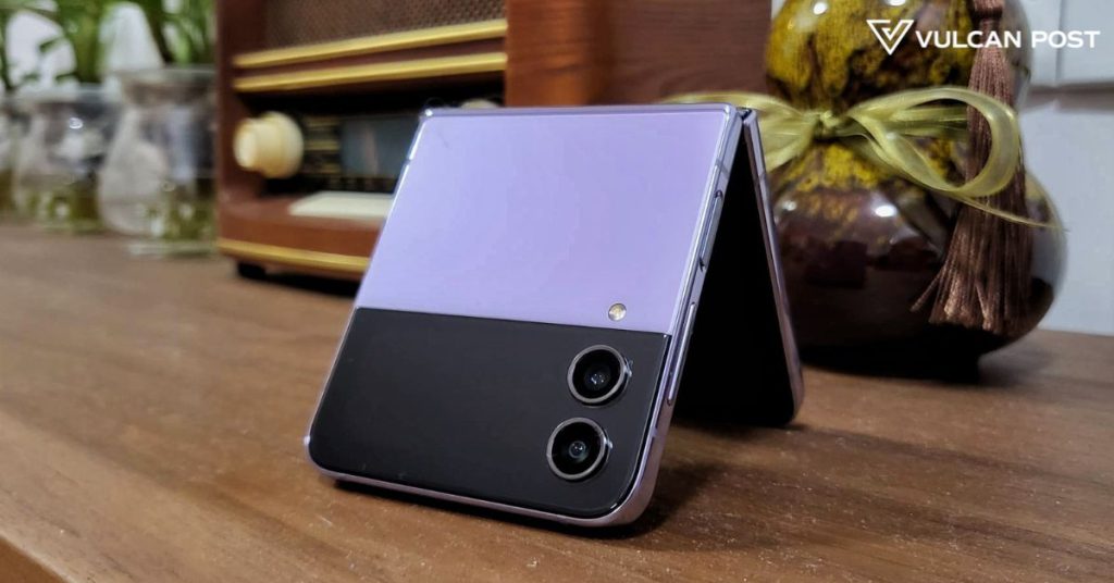
To my personal delight, I’ve got my hands on the beautiful and ever-so-elegant Bora Purple model of the Samsung Galaxy Z Flip4, a close match to the lavender case on my Z Flip3.
Beauty is on the outside

Right off the bat, there’s just something about the Z Flip4 that looks upgraded, more premium.
Perhaps it’s the hazy finish on the glass creating a soft contrast to the shiny metal frame, or the way the cover’s screen-to-body ratio of the folded phone looks just a little more… symmetrical.
The rear cameras that sit on the Z Flip4’s cover screen now have a higher bump as well, thanks to the metal frame protecting the lenses.

On the sides of the phone, the placements for the SIM card slot, USBC-charging port, volume rocker, and side-mounted fingerprint scanner have remained.
One of my hopes for the upgraded clamshell phone was that it would have a shorter height when it’s unfolded, and it looks like that came true.
Unfolding the Z Flip4, it stands 165.2mm tall, making it 1.5mm shorter than its predecessor. It’s also a tad wider and has a good weight to it at 187g.
Sad to say though, the gap in between the FHD+ AMOLED 2x displays when the phone is folded—I call it the thigh gap—is still present here, and it appears just as large as its predecessor’s.

Yet interestingly, when you unfold the phone and interact with the screen, the hinge feels shallower on the Z Flip4, making it less of a bother when scrolling through apps or watching videos.
A more functional cover screen and image processing
Previously, the cover screen on the Z Flip3 remained limited. While you could check the time and notifications, set a 10-minute timer, and start a voice recording, these conveniences were rather surface-level.
Samsung appears to have realised this too, and has now expanded its cover screen options, along with more themes and clock designs.
Some new additions include “quick reply” options for texts, toggling quick settings (eg. turning on and off your torch light, WiFi, and Bluetooth), and speed dialling three of your favourite contacts, all without flipping your phone open.

The cover display’s Quick Shot function still remains, where you can take a quick selfie using the phone’s main cameras by clicking the lock button twice. Furthermore, Quick Shot now allows you to switch between the portrait or normal mode to snap the photo.
Speaking of its cameras, the Z Flip4 comes with a 12MP wide, 12MP ultra-wide, and 10MP selfie camera, which are the exact same specs on its predecessor.
Although, looking at the side-by-side comparison of pictures taken, the Z Flip4 is able to produce more vibrant photos with better depth and colours. Perhaps it’s the improved post-image processing AI doing the work via its 4nm 64-bit Octa-Core Processor and updated Android 12 OS?
-//-
One persistent complaint about Samsung’s flip phones has been their battery life. On the Z Flip3, its total battery capacity stands at 3,300mAh.
The Z Flip4 comes with an upgraded battery at 3,700mAh, which has allowed me to benefit from the 120Hz screen refresh rate just a little more now. But, I’d still have to charge the phone up at least twice a day, which is normal practice while using its predecessor.
With an IPX8 water resistance rating, dust resistance is still lacking on the Z Flip4, unfortunately.
All in all, it looks like Samsung has taken quite a bit of the feedback from its users into account to make minute improvements to the Z Flip4. It will come at a starting price of RM4,099 for its lowest-spec variant, 8GB RAM with 128GB internal storage.
We’ll be doing a more comprehensive review on the phone very soon, so stay tuned!
All image credits: Vulcan Post


