What sort of thumbnail images best grab a viewer’s attention? This is a question that has plagued content producers everywhere.
Having worked in social media before, we are constantly experimenting with different types of images to see which types users gravitate towards the most. You may have noticed that the thumbnails to Netflix videos frequently change; this is because Netflix has been testing and observing us too, to see what thumbnails we like best.
And they seem to have found the answer.
The Netflix Formula
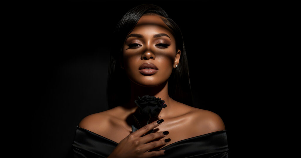
“Why do all Netflix thumbnails look so similar?” a keen observer might ask. Outside of removing spoilers from thumbnails, you may have noticed that Netflix thumbnails follow a particular pattern. The thumbnails frequently feature close-ups of emotionally expressive faces, usually show the villains, and often have three or less characters.
This isn’t by accident. Rather, these are trends Netflix has learned that make up an attractive image.
In a blog post on their website, Netflix shared detailed findings on how more expressive and complex facial expressions could compel people to watch a story more.
In addition, viewers have a higher response rate to visible and recognisable characters; they respond even more to villainous characters, especially polarising ones.
Images also tend to do better when containing three or fewer characters. While ensemble casts may catch our eyes in billboards or street advertising, they are too complex at small sizes and therefore not as effective. Having fewer characters also presents a more explicit focal point to draw the attention of viewers.
Furthermore, regional and cultural differences exist, and people from different regions and cultures will respond differently to different types of artwork. When you have a worldwide audience like Netflix, it’s up to you to find out what type of art your audience best responds to.
What Does This Mean For Content Creators?
Imagery is very important on the internet – a picture paints a thousand words after all.
Netflix has concluded that it has very little time to grab your attention; it’ll lose you if you aren’t drawn in within 90 seconds, and a typical viewer spends just 1.8 seconds considering each title (82 percent of the time based on the artwork). Without captivating images, you may just miss the next big hit.
So if you’re putting out content on sites like Facebook or Youtube, you can perhaps consider applying Netflix’s winning strategies to your thumbnails – show close-ups of emotionally expressive faces; no more than three characters; and polarising characters like villains.
Do you agree with Netflix’s findings? What types of images do you find yourself drawn towards?
Also Read: The Ultimate Guide To Awesome Photos People ‘Like’


