Arguably, fast food deliveries might be one of the most amazing innovations to be born out of our laziness and desire for convenience as human beings.
Once upon a time, you’d need to give the pizza guy a call to place a delivery order (shudder), but nowadays, the process has been even further streamlined and digitalised to the point where we just need to click a few buttons on our smartphones to enjoy some grub.
We even have aggregators like Grab, foodpanda, and airasia to be middlemen in delivering the food. But going straight to the source can sometimes have its perks.
I’m talking about fast food apps. As we’ll learn though, not all apps are created equal.
Here at Vulcan Post, we’ve decided to do the (very important) investigative work of trying out all the fast-food apps we could find in Malaysia to figure out which ones are actually worth downloading, with our priority placed on food delivery.

To be impartial, I’ll be mainly focusing on the user experience of the app itself, not the actual food.
6. A&W
A&W’s app was easily the most frustrating one to use.
It didn’t start off that way. We started off with hope, and we had good reason to be hopeful too. After all, we were greeted by a happy, waving A&W bear that seemed so pleased to serve us.

Instead of delicious waffles and hot dogs, though, we were served with disappointment.
It was a slow and gradual realisation that the app simply did not work. The first red flag was raised when the three circular icons corresponding to dine-in, takeaway, and drive-in suddenly just disappeared.
After waiting a whole day, though, the icons reappeared, so we quickly decided to place our orders.
But if you were paying attention, deliveries are not an option on the A&W app, so we settled on ordering in advance and dining in at a nearby outlet.
Their menu is true to the one in-store, complete with descriptions and pricing. I began getting excited about trying the Gula Melaka waffles, and so far, everything was pointing to the fact that I was going to be able to enjoy them soon.
That was, until we tried to check out.
Then nothing worked. Literally none of the checkout options worked. Instead of asking for our OTP, we were faced with a blank page. We even tried reordering on different phones (Android and iOS), but the results remained the same.
More than the app not working in the first place, this saddened me to a greater degree.
It dangled the proverbial carrots in front of our faces, and before we could even reach them, it simply snatched them away.
(When we went to the store just the other day, we saw displays and banners proudly asking users to download the app, so we asked the staff about it.
In her words, “Kadangkala boleh, kadangkala takleh.” (Sometimes can, sometimes cannot.) Well, we tried it again in the store, but alas, we were still ghosted by the checkout process.
| Criteria | Ratings |
| User interface and design | 3 – The interface is alright, to be honest |
| User experience | 1 – Not good, but I’d like to give a pity point |
| Order tracking | 0 – Not applicable |
| Payment options | 0 – Not applicable |
| Rewards/loyalty system | 1 – There’s supposedly a “Rootypoints” system, but it’s not clear how it works |
5. Marrybrown
Marrybrown, oh, Marrybrown, our beloved homegrown fast food brand. How it pains me to have to rank you so low on this list.
In its defense, the app is actually quite beautiful. It’s well-designed and easy to navigate. It does make users create an account in order to do pretty much anything, but that’s normal for these kinds of apps.

Through the app, you can order for pickup, dine-in, and even drive-through pickup via the app. The outlet selection also automatically sorts itself to show you the nearest outlet at the top. Plus, there’s a search bar for easy navigation.
On top of showing you all the deals available at Marrybrown, you can collect points via a QR Code. These points can be exchanged for freebies at Marrybrown.
So, you might be wondering—Claudia, it sounds like a great app? Why is it so far down this ranking?
However, I would say the one thing is that it definitely doesn’t work as a delivery app. It simply directs you to its partners, GrabFood, foodpanda, and ShopeeFood.
It’s not wrong for it to deploy partners for its delivery services, but being able to make the orders through the app itself would make its points collection and redemption system far more convenient and useful.
Therefore, compared to the other fast food apps on the rest of the list, it has to rank lower.
| Criteria | Ratings |
| User interface and design | 4 – The UI and design is organised and pretty |
| User experience | 2 – Not the best experience, but I can’t be too mad |
| Order tracking | 0 – Not applicable |
| Payment options | 0 – Not applicable |
| Rewards/loyalty system | 3 – The MB Reward Points system is straightforward |
4. Domino’s Pizza
In my opinion, Domino’s has some of the best delivery services. The tracking system always seems to work great, and food is always on time.
But we’re not here to discuss just its delivery prowess. We’re here to talk about its app.

To put it simply, Domino’s app is basically a port of its website. It functions exactly the same and has all the basics down pat. However, it definitely lacks sophistication and ease of use.
The coupon feature in specific was clunky. The first time I tried to use it, the coupon didn’t apply and each product in my basket maintained its original price.
On the second try, the app kept trying to get me to add another pizza even though I had selected the promo with one personal pizza.
Needless to say, Domino’s app isn’t anything remarkable. It does everything the website does, so in my opinion, I don’t think it’s worthy enough to keep around on your phone.
The one silver lining of Domino’s compared to the other apps, though, is the fact that you don’t need to create an account to start ordering.

| Criteria | Ratings |
| User interface and design | 1 – It’s messy and not very user-friendly |
| User experience | 3 – At the end of the day, it worked out alright |
| Order tracking | 5 – One of the best trackers in town |
| Payment options | 5 – It’s got everything you could need |
| Rewards/loyalty system | 0 – None that I could see |
3. McDonald’s
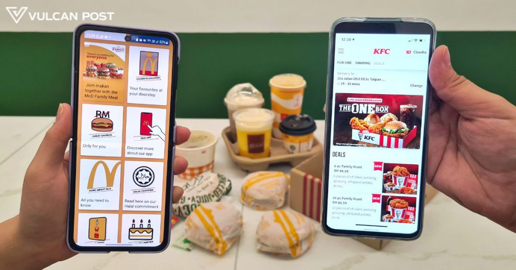
Like Domino’s, McDonald’s did everything right, but just not in a very attractive way.
This is mostly because the app isn’t just for McDelivery—it also includes information on all the brand’s other activities, so it makes sense why the app can seem overwhelming at first.
However, on the iPhone, the app seems to be a lot more neatly presented. We’re not sure if it’s just because the Google Play Store version hasn’t been updated.

Beyond its user interface, though, the app is easy to use. You do need to create an account, much like the other apps.
Payment options include online banking or e-wallets, credit or debit cards, and cash. The order tracking is also pretty complete.
My biggest gripe with this app, though, comes down to my inkling that it’s trying to get you to spend a lot more than you want to.

When we were ordering our meals, most of us simply wanted a soft drink. But, for the life of us, we could not find the soft drink options in the combo meals. The only drink option was to upsize to a McCafe drink.
I’ll give it the benefit of the doubt that it might be a glitch or a system error, but this definitely soured the experience of using the app.
The one edge is has over Domino’s is that it actually does have a rewards system, which I’m pretty sure is a new feature, actually. Although you can redeem your points via McDelivery, you can at least collect points.
| Criteria | Ratings |
| User interface and design | 3 – It’s a little messy on the Android version |
| User experience | 3 – The issue with the drinks soured the experience |
| Order tracking | 3 – Decent, but no map |
| Payment options | 5 – It’s got everything you could need |
| Rewards/loyalty system | 4 – Users can earn loyalty points to redeem rewards (We think it’s new) |
2. Pizza Hut
Although Pizza Hut’s app is also like a smaller version of its website, I felt like the user interface looked a lot better on mobile.

Once again, I had to create my own account, but that’s no big deal. Like Domino’s, Pizza Hut offers a lot of coupons and set deals, but it was more seamless compared to Domino’s.
Pizza Hut also shows all its categories up top (e.g. promos, pizzas, pastas, etc.), whereas Domino’s kept the menu on a separate page. So every time you click into each category, you have to press back in order to even look at what the other categories are.
The Pizza Hut app also lets you collect Hut Rewards. From what I can see, Domino’s does not feature a rewards programme, at least not on its app.

| Criteria | Ratings |
| User interface and design | 5 – It’s great and I love it |
| User experience | 5 – What can I say, it simply does everything I need it to |
| Order tracking | 3 – Definitely not the best |
| Payment options | 5 – It’s got everything you could need |
| Rewards/loyalty system | 4 – The Hut Rewards is very straightforward |
1. KFC
At the very top of my list is Kentucky Fried Chicken, and I assure you I have a good reason for the ranking.
First of all, it’s the one fast food app I’ve actually kept on my phone for a while now. To cut to the chase, the reason is that the app offers exclusive deals that can’t be found on its website. This incentivises the usage of the app.

But beyond this strategic play from KFC, I actually also really like the usability and navigational ease of the app.
The organisation might seem weird to some, as the products are primarily broken down into “Meals for One”, “Meals for Sharing”, and “Deals”, rather than, say, “Chicken”, and “Burger”. But within each category, it’s further broken down into box meals, chicken meals, burgers, sides, and drinks.
The app is simple and to the point, which makes it a lot better compared to the McDonald’s app. Realistically, how many people are actually downloading the McD app for the news alert and job vacancies? I’m sure it’s useful for some, but I think those details are better kept to its website.
On KFC’s app, there’s a lot less clutter. It’s more user-friendly, which is why it’s my favourite fast-food app. The side menu is straightforward, with options to get delivery or self-collect, find a KFC store, contact customer service, read the Halal policy, and access the FAQ.

The one thing KFC is poor in, though, is its tracking system. It doesn’t show the riders’ map, and my personal experience with KFC riders is that they will often say they’ve already arrived when they haven’t, which makes me panic.
The only good thing with the tracking is that it tells you upfront if KFC is using a partner’s riders (foodpanda or GrabFood, usually), so you know exactly who to look for when getting your order.
| Criteria | Ratings |
| User interface and design | 5 – Everything is in the right spot |
| User experience | 5 – A great experience throughout |
| Order tracking | 3 – Not the best, but it’s something |
| Payment options | 5 – It’s got everything you could need |
| Rewards/loyalty system | 5 – I prefer exclusive deals over loyalty programmes where you need to keep buying to get rewards |
Final thoughts
Here’s a recap of how the apps scored:
| Criteria | A&W | Marrybrown | Domino’s | McDonald’s | Pizza Hut | KFC |
| User interface and design | 3 | 4 | 1 | 3 | 5 | 5 |
| User experience | 1 | 2 | 3 | 3 | 5 | 5 |
| Order tracking | 0 | 0 | 5 | 3 | 3 | 3 |
| Payment options | 0 | 0 | 5 | 5 | 5 | 5 |
| Rewards/loyalty system | 1 | 3 | 0 | 4 | 4 | 5 |
| Total | 5 | 9 | 14 | 18 | 22 | 23 |
With an exponentially growing gallery and a newfound joy of playing games on my phone, I need each fast-food app to justify its place in my storage space, however small the file size actually is.

From my experience using all of the fast-food apps listed above, KFC was the only one that was providing discounts that its website lacked. It was the reason I downloaded it in the first place.
As for the others, though their websites work fine for the most part, I understand if you want to keep the app around for convenience, even if it’s just for something as simple as checking their updated menus.
- Read other articles we’ve written about F&B here.


