You’d think that with the release of the OPPO Find N2 Flip, the brand’s first flip-foldable, there’d be a lot of interesting stuff to talk about, but… there isn’t.
That’s not a bad thing though. Foldable phones aren’t even the norm yet, so it’s nice to see that OPPO is simply improving on what’s already out there, making the technology more attractive. Baby steps, baby steps.
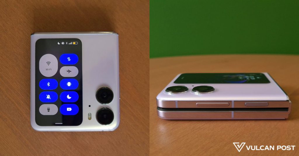
For this review, we got the Find N2 Flip in Moonlit Purple, and it’s a gorgeous colour. It’s a pale, pearlescent purple, with a pretty sheen under natural light.
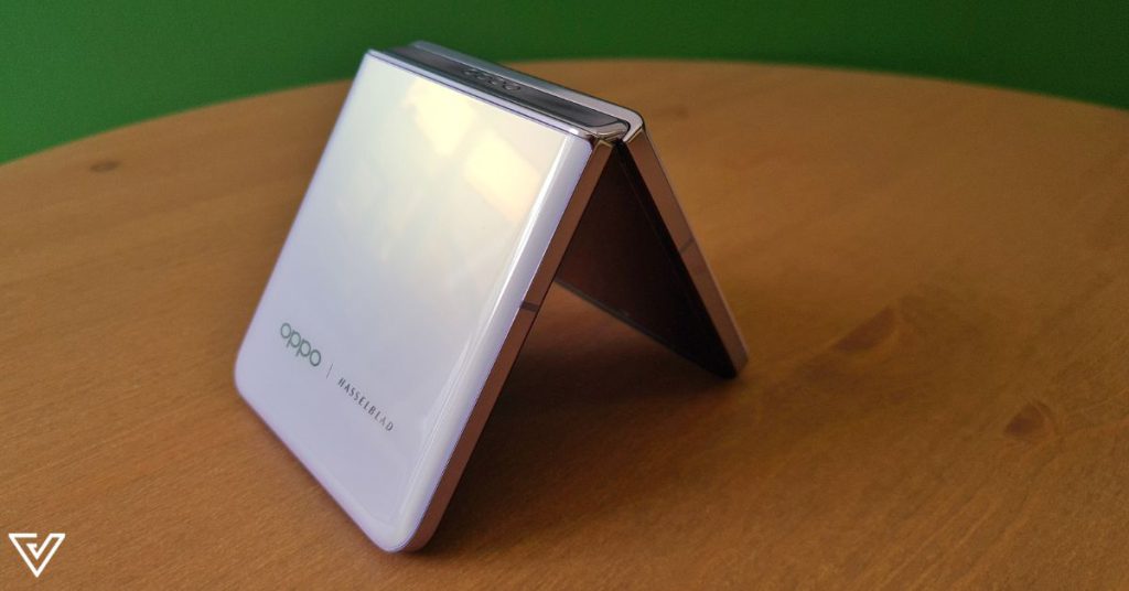
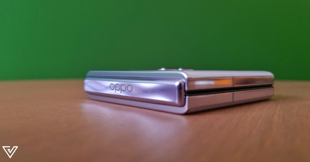
On the hinge running horizontally across the back is a debossing of “oppo” and a classy wave-like design.
Bigger, but not unique-er
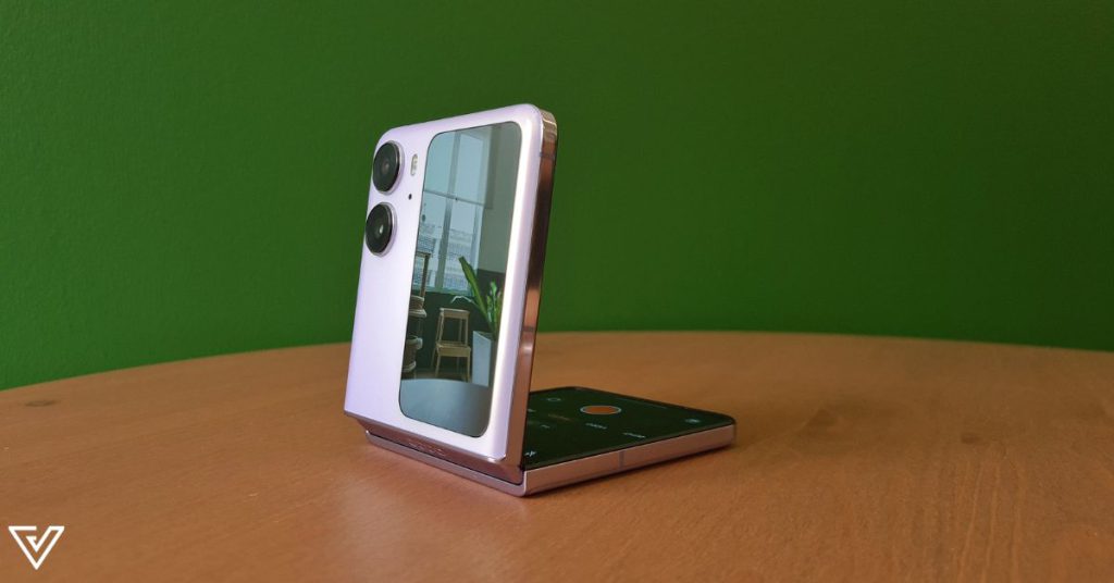
Subtle, tasteful touches aside, there’s something less subtle that cannot be ignored on the back: the 3.26-inch cover screen.
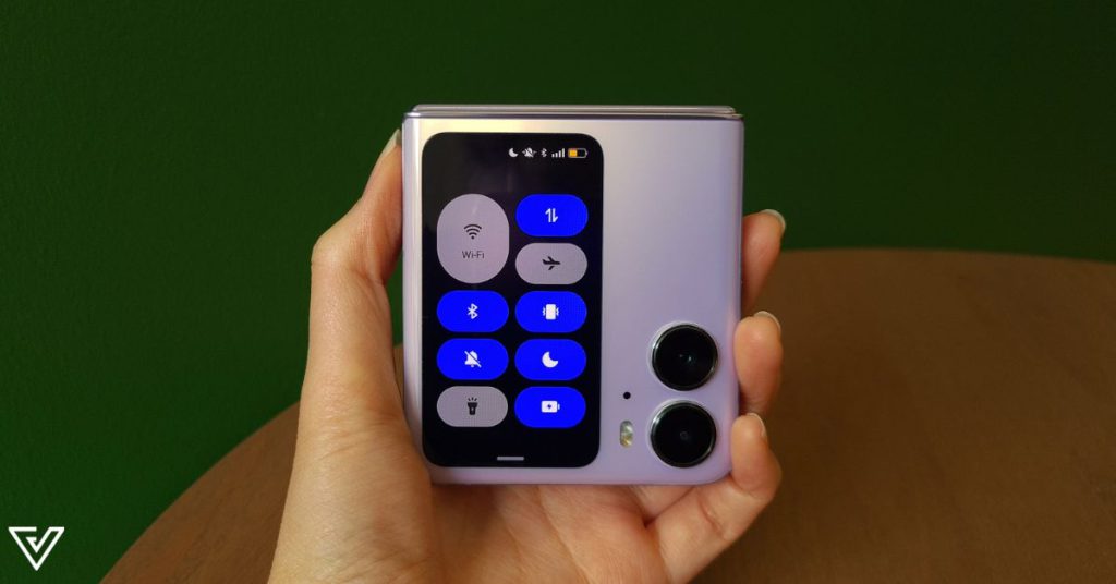
It’s the largest yet on the flip-foldable market right now, so that’s certainly something to be impressed about.
Size aside, there are other key differences between the cover screens of the Find N2 Flip and its closest rival, Samsung Galaxy Z Flip4.
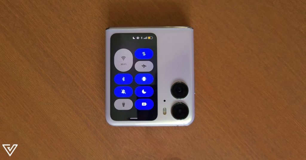
The Find N2 Flip is vertically-oriented, making it more similar to having a tiny phone screen on the front, compared to the Z Flip4’s horizontal orientation.
One thing that I really liked about the Find N2 Flip’s cover screen is also how its wallpaper can match exactly what’s on your home screen, thanks to its orientation.
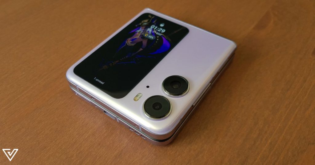
On the Z Flip4, you have a limited number of pre-set wallpaper options, and any customisation fun would mostly come from matching your cover screen wallpaper to your Samsung smartwatch face.
At their core though, both cover screens function similarly. I was actually excited to see if the Find N2 Flip’s large cover screen would act like the Z Fold4’s, which is pretty much a mainstream phone’s regular display, if not a tad narrower.
How cool would it have been to see everything you see on the main display in miniature size? Sure, it’d probably induce eye strain, but if we really cared about that we wouldn’t be on our devices at least nine hours a day, right?
Well, back to the point, and the point is that the Find N2 Flip’s cover screen is just another widget control centre. Nothing new, but its vertical orientation does at least let you see more text in a message preview.
Flatter is better
Opening up the phone, you get a 6.8-inch LTPO AMOLED display that goes up to 120Hz. Before delving into that, we have to talk about the hinge.
It’s smooth, and it shuts completely flat, making it less likely for debris or objects to slip in between and damage your screen.
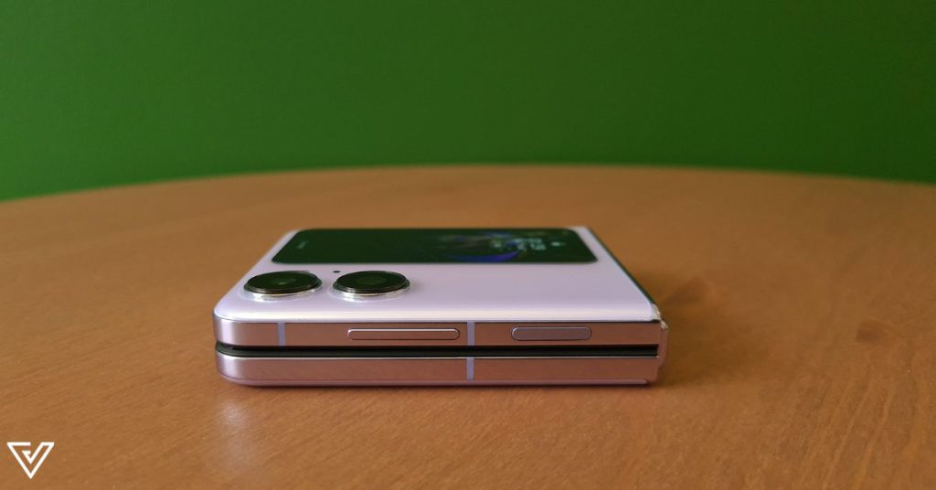
However, this does make me wonder why the Z Flip4 has kept the “thigh gap” since the Z Flip’s inception. Better heat dissipation, perhaps?
A flip-foldable that shuts completely flat is not new though. The Huawei P50 Pocket already did that over a year ago.
Also similar to the P50 Pocket is just how too smooth the Find N2 Flip’s hinge is. It’s a bit difficult to keep it propped open at a more obtuse or acute angle, because it either wants to spring completely open or snap shut.
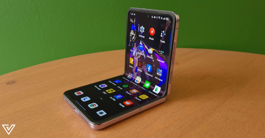
In this sense, I prefer the stiffer Z Flip4’s hinge more.
A decreased crease
Every single review I read or watch on a foldable phone seems to always point out the screen crease where the hinge is. I’ve never been bothered by the crease.
For those who do care though, good news, it’s less obvious than the Z Flip4’s. Or, at least, that’s what other reviewers say.
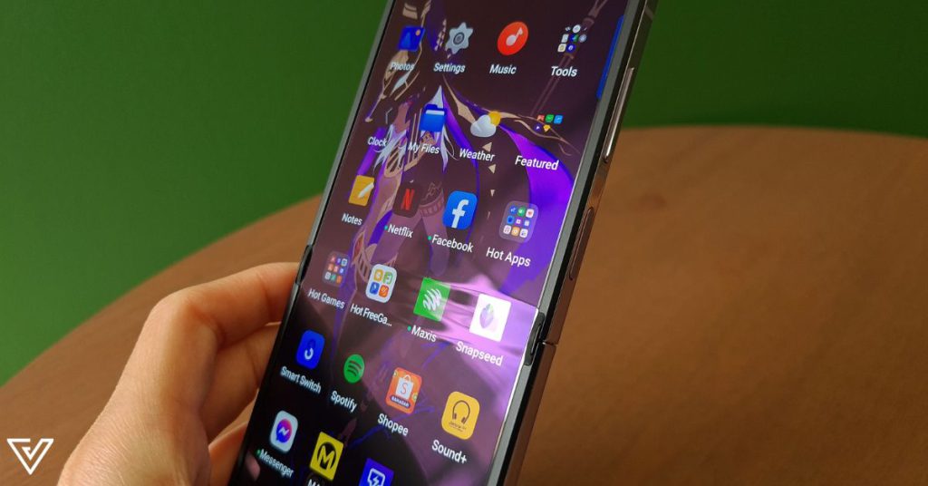
Speaking of the screen as well, I realised that whenever I wore my sunglasses and had to use the Find N2 Flip for Waze, I could not see a darn thing. The screen just looked black, no matter how high its brightness was.
Maybe it was my polarised lenses, or maybe it’s that the phone screen has some weird coating. Either way, I suffered. The Z Flips’ screens do the same too.
On the productivity front, the Z Flips get a win over the Find N2 Flip. There’s simply just… not much you can do with its foldability, apart from taking a photo hands-free (we’ll get into the cameras in a second).
If I’m trying to multitask on my phone, I usually like to have YouTube on the top half and either a Notes app or a messaging app on the bottom half.
I couldn’t do any of that on the OPPO. Well, I couldn’t have both YouTube and the Notes app open, nor could I have YouTube and the Clock app open.
The phone would even tell me that those (Notes and Clock) apps weren’t supported for split-screen! Those are literally your own apps, my dude, what do you mean?
A look at the cameras
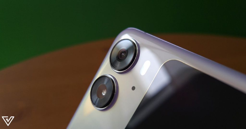
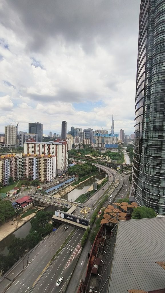
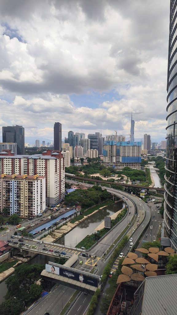
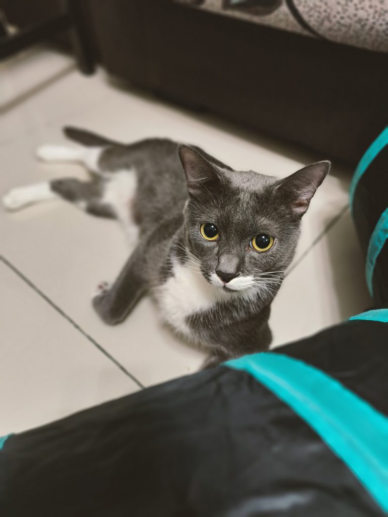
Or, cam-ehhh-ras, to be franker. I’m sure I’ve seen better, both from OPPO and other brands. Sure, its two cameras are co-developed with Hasselblad, and have flagship Sony sensors and the MariSilicon X Imaging NPU chips.
The colours in captured images are pretty nice to look at. But I’m more of a details gal, and OPPO simply didn’t deliver in that area.
To my eyes, the Z Flip4 delivered crisper images while still serving really nice colours. For the average Joe or plain Jane, the Find N2 Flip’s cameras would be pretty good.
When it comes to cameras though, I feel like once you’ve had better, you can’t go back. That’s why I wasn’t too impressed with the OPPO.
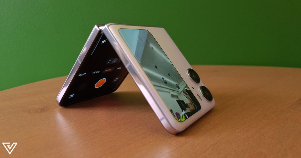
Of course, its cameras shine in a different way if compared to mainstream phones. For one, there’s the foldability, which means you can open it anywhere from 45° to 120° and set a timer to take hands-free pictures.
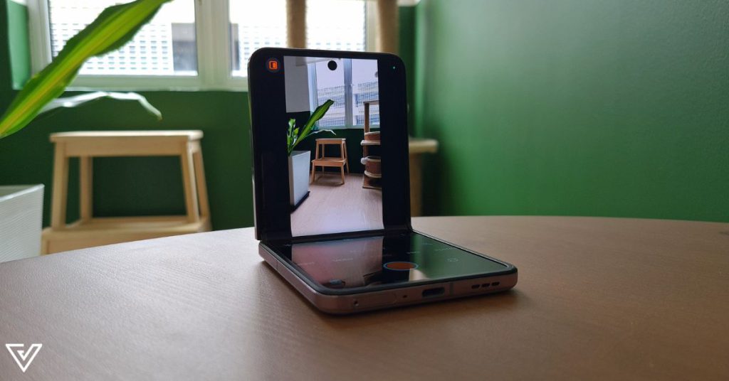
Secondly, the cover screen can show your subjects a preview of what they look like as you snap their photo. Or, as your mirror to take a nice selfie with the main cameras.
Verdict
Before ending this review, there are actually two more points I wanted to touch on about my usage of the Find N2 Flip.
Firstly, its 4,300mAh battery is simply delightful and makes the Z Flip4’s 3,700mAh battery look puny in comparison.
It usually lasted me the entire day of regular usage. And despite the constant, annoying message of the phone being optimised every time I cleared my Recent Apps (I felt like a child being told “Good job!” by an adult), I appreciated the phone’s effort in telling me it would now stay alive for as long as possible.
The next thing to mention is that the phone attracts fingerprints like nobody’s business. I’ve never had such an irritating fingerprint problem on a phone until the Find N2 Flip, and surely I couldn’t have gotten dirtier fingers just over the two weeks of reviewing it.
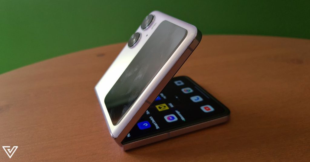
I was constantly wiping it down, brushing it off, but in the next second, there would be a new fingerprint and lint and dust all over it.
Even the included phone protective cover was prone to these. I soon gave up the fight to prioritise my mental health.
Powered by a MediaTek Dimensity 9000+ chipset, the Find N2 Flip dishes out a decent performance, though I didn’t find it anything to shout about. Look elsewhere for a productivity driver or gaming device.
In all, the Find N2 Flip is a fun foldable, wins on the aesthetic front for flip-foldables, and has good cameras (as some would argue).
But you must be content with having to clean your phone 24/7 lest you seem like a slob, and a severe lack of split-screen functionality.
The OPPO Find N2 Flip can be purchased for RM3,999 (8GB + 256GB).
| Pros | Cons |
|---|---|
| Larger cover screen allows you to view more notifications | Larger cover screen remains a widget control centre and can’t do more |
| Phone flips shut with no gap | Cameras appear subpar compared to rival flip-foldables |
| Largest battery in a flip-foldable and lasts long | Little to no split-screen functionality |
VP Verdict is a series where we personally try and test out products, services, fads, and apps. Want to suggest something else for us to try? Leave a comment here or send the suggestion to our Facebook page.
Also Read: Navigate hybrid work’s pain points like productivity & security issues via this webinar


